Strick.PlusCon
Grids
A Grid consists of rows and columns of data that is displayed in a tabular format.
Each Column is sized automatically to fit its widest content.
In addition to the rows and columns, grids can also have a Title, Subtitle and Footer.
The titles are shown above the rows/columns, the footer is beneath the rows/columns.
The appearance and layout of the grid’s columns, rows, and cells can be customized through the use of properties available at the various levels. The styling for the titles and footer can also be customized.
Grid Class
To create a grid, use the Grid class. Add columns and rows.
Then use the Show method to display the grid.
Columns can be added using any of the various AddColumn methods or the
grid’s Columns collection.
Rows can be added using any of the various AddRow methods or the grid’s
Rows collection.
There is also an AddSeparatorRow method that will add a
“separator” row to the grid. A separator row is just a normal row with
each cell’s FillerChar property set to the value of the fillerChar
argument, and each cell’s Content property set to null.
Styling for all the grid’s cells can be set via the CellStyle, and CellContentStyle properties.
These styles can be overridden at the column, row, and cell level.
Styling for all the grid’s column headers can be set via the ColumnHeaderCellStyle, and ColumnHeaderContentStyle properties.
These styles can be overridden for each column. Rendering of column headers can be
controlled via the ShowColumnHeaders property.
The Title, Subtitle and Footer properties are StyledText objects.
See the doc for the TextStyle and StyledText classes
for information on how to apply styling to these grid elements. Additionally, there are
alignment properties for each (TitleAlignment, SubtitleAlignment, FooterAlignment)
that control the horizontal alignment of the content.
Note: Calling the Show method if the grid does not have at least one column and one row will
result in an exception being thrown. After all, it is somewhat pointless to display a grid
without at least one of each.
The Grid class has a Find method that will perform a search of all the grid’s cells
and return a sequence containing the matching cells.
The find method takes a GridSearchExpression argument.
GridColumn Class
Represents a column in a grid.
A column has a Header property that returns a GridHeaderCell object for its header cell.
The read-only Header property will always have a non-null value.
The various properties of the Header object can be used to control the content, appearance and layout
of the column’s header.
The column’s CellLayout property controls the layout for the column’s cells, including
the Header cell.
The styling for a column’s cells can be set through its CellStyle and ContentStyle properties.
Setting these styles will override the styles inherited from the grid.
A column always has a Cells collection, which always contains the same number of
GridCell objects as the grid’s Rows collection (even if zero).
The HasCells property returns a boolean indicating whether or not the column has any cells
(i.e. whether or not the grid has any rows). The Cells collection is readonly – to add rows
to a grid, use the Rows collection, or one of the AddRow methods of the Grid object.
The GridColumn class has Find, FindFirst, FindRows and FindFirstRow methods
that will perform a search of all the columns’s cells.
These methods take a GridSearchExpression argument and
return a sequence containing
the matching cells (Find)
or rows (FindRows),
the first matching cell (FindFirst),
or the first matching row (FindFirstRow).
GridColumns Class
The GridColumns class represents a collection of GridColumn objects for a grid (Grid.Columns).
GridColumns implements the IReadOnlyList<GridColumn> interface and also includes IndexOf,
Add, Remove, and RemoveAt methods to allow limited manipulation of the collection.
If a column is added to the grid when it has rows, cells are automatically added to each
row’s Cells collection.
If a column is removed from the grid when it has rows, the corresponding cell is automatically
removed from each row’s Cells collection.
GridRow Class
Represents a row in a grid.
A row always has a Cells collection, which always contains the same number of
GridCell objects as the grid’s Columns collection (even if zero).
The HasCells property returns a boolean indicating whether or not the row has any cells
(i.e. whether or not the grid has any columns).
If a column is added to the grid, cells are automatically added to each row.
If a column is removed from the grid, the corresponding cell is automatically removed from
each row.
The Cells collection is readonly – to add columns to a grid, use the Columns
collection, or one of the AddColumn methods of the Grid object.
The styling for a row’s cells can be set through its CellStyle and ContentStyle properties.
Setting these styles will override the styles inherited from the column or grid.
The GridRow class has Find, FindFirst, FindColumns and FindFirstColumn methods
that will perform a search of all the row’s cells.
These methods take a GridSearchExpression argument and
return a sequence containing
the matching cells (Find)
or columns (FindColumns),
the first matching cell (FindFirst),
or the first matching column (FindFirstColumn).
GridCell Class
The content to be displayed in a given cell can be accessed via it’s (read/write)
Content property.
The Content property is a string value, so to display a value from any other type of
object, convert the value to a string. Empty string and null values are acceptable.
A null indicates the cell has no content, and an empty string is considered to be
“empty” content.
A cell has two types of text styling: cell styling and content styling.
Cell styling applies to the whole cell (i.e. the non-content area of the cell).
Content styling applies only to the cell’s content.
A cell’s text styling is inherited from its row, column or the grid (in that order),
however the styling can be overridden for an individual cell using the cell’s
CellStyle and ContentStyle properties.
A cell’s layout is inherited from the column (GridColumn.CellLayout).
The horizontal alignment of an individual cell can be overridden via the
cell’s HorizontalAlignment property. The cell’s other layout properties (margins, padding)
cannot be overridden.
A cell has readonly properties for Column, ColumnIndex, Row, and RowIndex.
These return information regarding the cell’s position within the grid.
Both the ColumnIndex and RowIndex properties are zero-based.
When a cell is rendered for display in the grid, the cell’s content is styled
using the cell’s ContentStyle (or the content style inherited from the
row, column or grid), and is padded with the number of characters specified
by the PaddingLeft, PaddingLeftChar, PaddingRight, and PaddingRightChar
properties of the column’s CellLayout. If the cell has NO content
(the cell’s Content property is null), the cell will contain NO padding
(the padding is considered Content padding, not cell padding).
The cell may additionally contain “filler” so that the cell’s width
meets the widest cell in the column. The character used for the cell’s filler
can be set via the FillerChar property. The cell is also padded with the
number of characters specified by the MarginLeft, MarginLeftChar,
MarginRight, and MarginRightChar properties of the column’s CellLayout.
Padding and “filler” are part of the cell and styled using the cell’s CellStyle
(or the cell style inherited from the row, column or grid).
Margins are NOT part of the cell, and no styling is applied to the margins.
Extensions
There are a couple of extension methods that operate on a sequence of GridCell
objects.
The Find extension method operates on any collection (that implements IEnumerable)
of cells and takes a GridSearchExpression parameter. The cells can be any sequence of cells
from a grid, such as all the cells from a single row, or column, all the cells
from the grid, any subset of cells from a grid, row, column, or
any combination thereof. As with the Find methods for the grid, row or column,
it will return a sequence of matching cells.
The SetFillerChar extension method also operates on any collection of cells and
takes a char argument. The FillerChar property of each cell in the sequence
is set to the value of the char argument.
GridHeaderCell Class
A header cell contains the content and styling for a column header. The header for a column
can be accessed through the column’s Header property.
A header cell’s styling and layout work the same as a normal GridCell object.
Note: Since a header is not in a “row” of the grid, a header cell does NOT have a Row or RowIndex property.
GridCellLayout Class
Allows alignment, padding and margins to be specified for columns and cells.
When a grid cell is rendered, Padding is part of the cell, Margins are outside the cell.
GridSearchExpression Class
The GridSearchExpression class represents a search expression that is used by
the Find methods for Grid, GridColumn, GridRow and the
IEnumerable<GridCell> extension.
The Text property specifies the text to search for. Both null and empty string are
acceptable, and search for cells containing those values, respectively.
The Type property (SearchType enum) specifies the type of search to perform.
The default is Equals.
The ComparisonType property (System.StringComparison) designates the comparison
type used for the search. The default is OrdinalIgnoreCase.
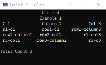
Examples
Basics
Grid g = new();
g.Title = new("Grid".SpaceOut());
g.Subtitle = new("Example 1");

g.Columns.Add("C 1");
g.Columns.Add("Column 2", HorizontalAlignment.Center);
g.Columns.Add("Col 3", HorizontalAlignment.Right);

g.AddRow("r1-c1", "row1-c2", "row1-column3");
g.AddRow("row2-column1", "row2-col2", "r2-col3");
g.AddRow("r3-col1", "row3-column2", "r3-c3");

g.Footer = new($"Total Count {g.RowCount}");
g.FooterAlignment = HorizontalAlignment.Left;

g.AddSeparatorRow('-');

g.Show();
RK();
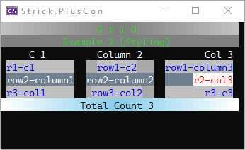
Styling
Grid g = new();
g.Title = new("Grid".SpaceOut(), new TextStyle(Color.Silver, Color.Gray, Color.Silver) { BackColor = Color.LimeGreen, Reverse = true });
g.Subtitle = new("Example 2 (Styling)", Color.LimeGreen, Color.Gray);

//set cell/content styling for entire grid
g.CellStyle = new(Color.DodgerBlue, Color.Silver);
g.CellContentStyle = new(Color.Blue, Color.Silver);
g.ColumnHeaderContentStyle.Underline = false;
g.ColumnHeaderCellStyle.Underline = false;

GridColumn col = g.Columns.Add("C 1");
col.Header.HorizontalAlignment = HorizontalAlignment.Center; //override column header alignment

col = g.Columns.Add("Column 2", HorizontalAlignment.Center);
//override styling for column
col.CellStyle = new() { BackColor = Color.DarkGray };

g.Columns.Add("Col 3", HorizontalAlignment.Right);

g.AddRow("r1-c1", "row1-c2", "row1-column3");
GridRow row = g.AddRow("row2-column1", "row2-column2", "r2-col3");
//override styling for row
row.CellStyle = new(Color.White, Color.SlateGray);
row.ContentStyle = new(Color.White, Color.SlateGray);
//override styling for specific cell
GridCell cell = row.Cells[2];
cell.ContentStyle = new(Color.Red, Color.White);
cell.CellStyle = new(Color.White, Color.SlateGray);

g.AddRow("r3-col1", "row3-col2", "r3-c3");

g.Footer = new("Total Count 3", Color.White, Color.SkyBlue, Color.White);
g.Footer.Style.Reverse = true;
g.Show();
RK();
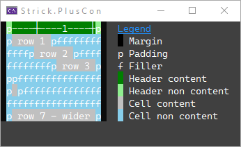
Cell Rendering & Layout
This example illustrates how cells are structured (including content, margins, padding, and filler) when a grid is rendered.
Color text = Color.White;
Color background = Color.FromArgb(64, 64, 64);
Grid grid = new Grid();
grid.ColumnHeaderContentStyle.BackColor = Color.Green;
grid.ColumnHeaderContentStyle.Underline = false;
grid.ColumnHeaderCellStyle.Underline = false;
grid.ColumnHeaderCellStyle.BackColor = Color.LightGreen;
grid.CellContentStyle.BackColor = Color.Silver;
grid.CellStyle.BackColor = Color.SkyBlue;

GridColumn col = grid.AddColumn();
col.CellLayout.PaddingLeft = 1;
col.CellLayout.PaddingLeftChar = 'p';
col.CellLayout.PaddingRight = 1;
col.CellLayout.PaddingRightChar = 'p';
col.Header.FillerChar = 'f';

GridRow row = grid.AddRow(" row 1 ");
row = grid.AddRow(" row 2 ");
row.Cells[0].HorizontalAlignment = HorizontalAlignment.Center;
row = grid.AddRow(" row 3 ");
row.Cells[0].HorizontalAlignment = HorizontalAlignment.Right;
grid.AddRow(""); //"empty" (zero-length) content -- will have padding
grid.AddRow(" ");
grid.AddRow(); //null (no content) -- no padding
grid.AddRow(" row 7 - wider ");

col.Header.Content = Ruler.GetH(col.ContentWidth, colors: null);
col.Cells.SetFillerChar('f');

CLS(background);
W(EscapeCodes.ColorReset_Back);
grid.Show();

int legendLeft = grid.Width + 2;
Console.SetCursorPosition(legendLeft, 0);
W("Legend", new TextStyle(Color.DodgerBlue, background) { Underline = true });
Console.SetCursorPosition(legendLeft, 1);
W(" ", text, Color.Black);
W(" Margin", text, background);
Console.SetCursorPosition(legendLeft, 2);
W("p Padding", text, background);
Console.SetCursorPosition(legendLeft, 3);
W("f Filler", text, background);
Console.SetCursorPosition(legendLeft, 4);
W(" ", text, grid.ColumnHeaderContentStyle.BackColor);
W(" Header content", text, background);
Console.SetCursorPosition(legendLeft, 5);
W(" ", text, grid.ColumnHeaderCellStyle.BackColor);
W(" Header non content", text, background);
Console.SetCursorPosition(legendLeft, 6);
W(" ", text, grid.CellContentStyle.BackColor);
W(" Cell content", text, background);
Console.SetCursorPosition(legendLeft, 7);
W(" ", text, grid.CellStyle.BackColor);
W(" Cell non content", text, background);
RK();